


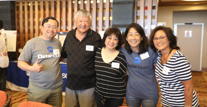
Make DataHouse your `ohana
Once you're part of our `ohana (family), we got your backs.
Career Development
With our International Training Program, Track Management program, and Individual Development Plan, we provide a transparent and flexible path to unlock your professional potential and achieve success.

Competitive Benefits
We prioritize your well-being by offering comprehensive physical and emotional support. Our goal is to secure a globally diverse workforce while promoting a healthy work-life balance.

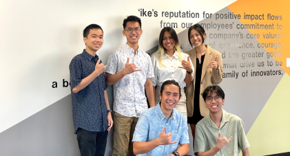
Global Teams, Local Impact
We continuously expand our staff, geographical reach, partnerships, and client base, reinforcing our robust global network of high-achieving individuals and organizations.
Let your career thrive at DataHouse
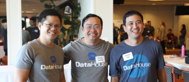
Experienced Professionals
Experienced Professionals
Bring your expertise to solve clients’ most challenging problems using the latest technology to do extraordinary things. Join us and discover how you can harness the power of technology and ideas to drive change.
Bring your expertise to solve clients’ most challenging problems using the latest technology to do extraordinary things. Join us and discover how you can harness the power of technology and ideas to drive change.
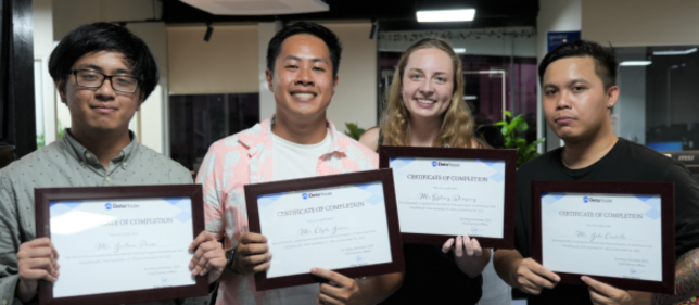
Students and Graduates
Students and Graduates
Bring your knowledge to the next level as you will be surrounded by teams and people who challenge you, support you, and inspire you to be extraordinary. Join us and make the most of unparalleled learning opportunities at DataHouse where you can make an impact your way.
Bring your knowledge to the next level as you will be surrounded by teams and people who challenge you, support you, and inspire you to be extraordinary. Join us and make the most of unparalleled learning opportunities at DataHouse where you can make an impact your way.


Awards and Recognition
To be a leader in advancing our community through smart innovation and collaboration for a better world.
+45
years of innovation
+400
global employees
5
office locations


Awards and Recognition
+45
years of innovation
+400
global employees
5
office locations


Get ready to start
Learn more about us on Frequently Asked Questions (FAQs).
What’s it like to work at DataHouse?
What is the typical duration between receiving an invitation for job interviews and the actual interview dates?
In what language should I submit my application documents?
Get ready to start
Learn more about us on Frequently Asked Questions (FAQs).
What’s it like to work at DataHouse?
What is the typical duration between receiving an invitation for job interviews and the actual interview dates?
In what language should I submit my application documents?
